design system "Lens"
Charlie Ussery (Lead product designer)
Goals: Consistency, scalability, and productivity
team: Kent Akins (lead engineer)
Consistently inconsistent
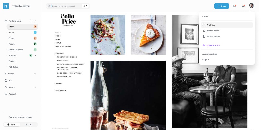
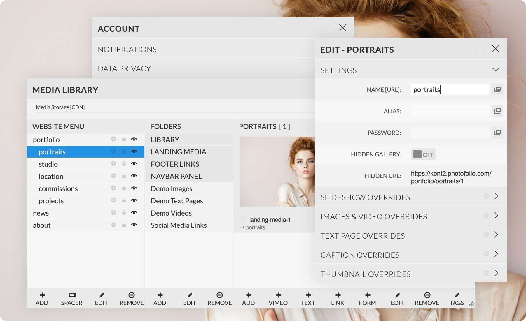
This was the 3rd iteration of the photofolio web admin. Having been an app that was around during the heydays of "adobe flash" our team had a lot of institutional knowledge siloed on what specific use cases we were trying to design for. We performed an extensive multi-stakeholder audit collecting all the different types of styles and components and grouped them into categories including: text styles, colors, icons, buttons, navigation, headers, footers, cards, forms, lists and other UI blocks.
Input size, padding, and color were huge issues for accessibility and visual hiearchy
• Designers were confused as there was no single source of truth.
• Developers were frustrated with creating duplicate components which slowed them down.
• Users were struggling to learn multiple UI patterns to perform the same task across different applications.
These issues would only get worse as our product team grew. There wasn't a budget or resources to create a dedicated design system team, so we simply chipped away at it as best we could, creating new components and styles incrementally.
Starting off with research to help
re-define POV's and HMW
This was the 3rd iteration of the photofolio web admin. Having been a SAAS app that was around during the days of adobe flash our team had a lot of institutional knowledge siloed on what specific use cases we were trying to design for. We performed an extensive multi-stakeholder audit collecting all the different types of styles and components and grouped them into categories including: text styles, colours, icons, buttons ,navigation, headers, footers, cards, forms, lists and other UI blocks.
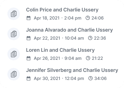
We also performed half a dozen user interviews with a wide array of customers. We wanted to ensure we weren't repeating past mistakes and factoring in new web technology and developer tooling.
Defining our users & planning
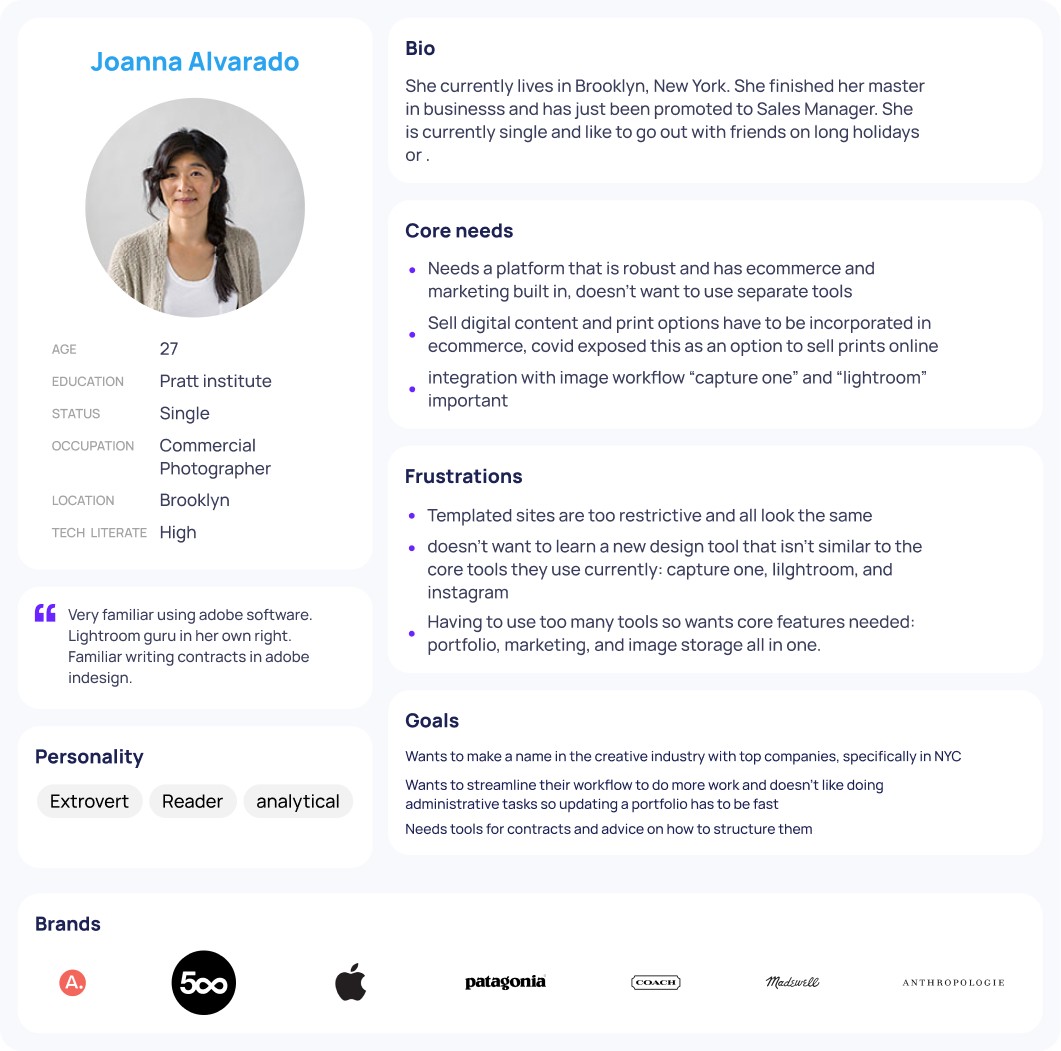
Our previous persona's were more proto in nature and weren't data-driven by interviews, competitive analysis, or market research.
We synthesized all of our insights from our research and created 3 different persona's. This allowed us to roadmap and prioritize our new core feature set. Since this was a redefining version of how the admin worked we wanted to ensure the core feature set was fast and easy to use before we started to add more features, primarily e-commerce and print products. Before moving forward into any building we wanted to identify the top user/task flows for each persona.
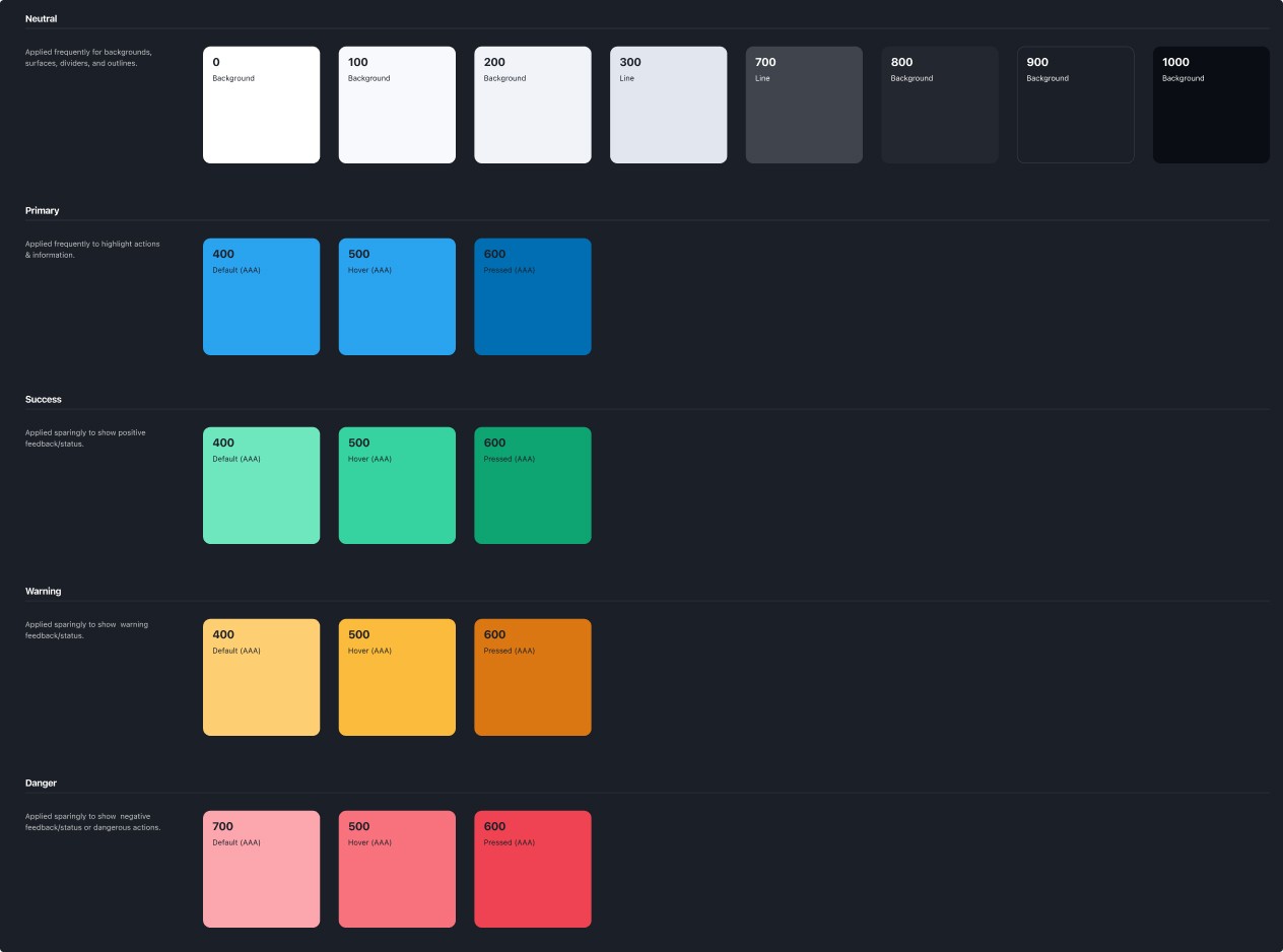
Defining global style guidelines
After the audit was done. We decided collaboratively on what should stay and what should go, based primarily on heuristic evaluation. Old unwanted and inconsistent styles and components were mapped to new ones in Google Sheets to help the development team transition.
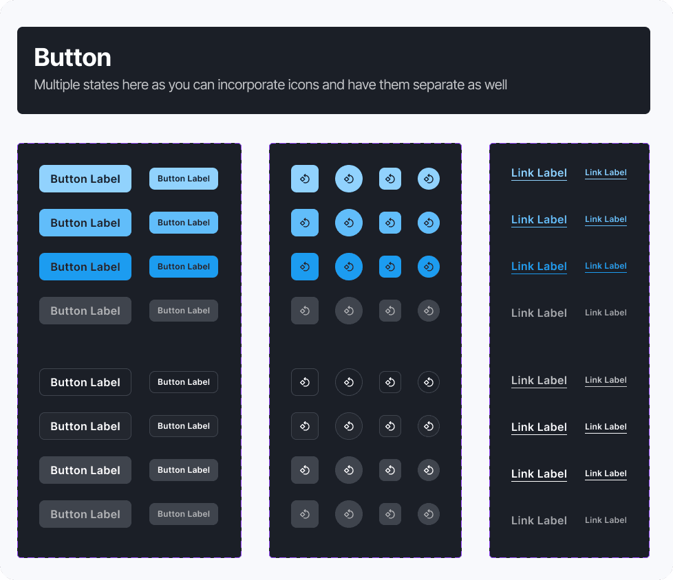
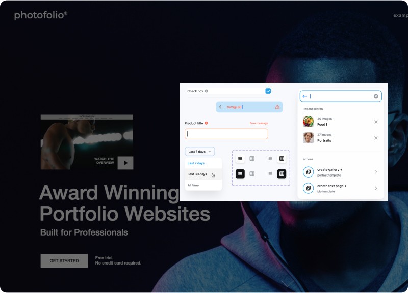
The structure of a button component lends itself perfectly to get the ball rolling on a new design system. When creating a button you have to choose iconography, brand colors, background shape, define success states, interactions, etc..
typography
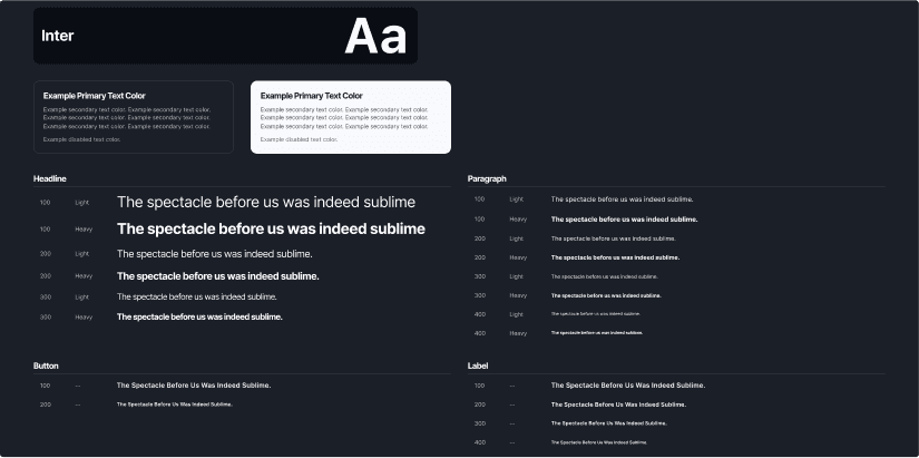
There were numerous text styles and fonts being used across platforms, so I reduced them dramatically and decided to use our custom brand font, Inter (seen in the image to the left), across all platforms for simplicity and consistency. It has a great x-height and is robust enough for all types of applications. We also defined our copy guidelines.
• Write short sentences.
Use headings and bullets to make your content easier to scan.
Avoid jargon and always choose a short, simple word over a long and complicated one.
Calls to action on buttons and links should start with a strong verb that describes the action.
Creating a component library
After defining our style guide we jumped into creating our component library. Our team had a few sessions where we did some rough sketching and wireframing of layouts but since our application was predominantly used on a laptop/desktop view, we already had a solid understanding of how and where the main UI components would be. Using Jakob's law and the fact that our user base would be transitioning over to this new version we didn't want to disrupt familiarity of the menu and design panels.
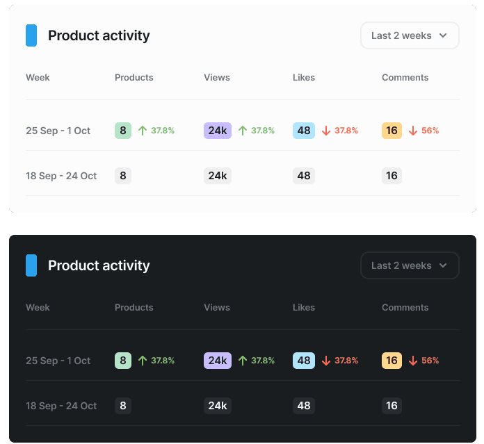
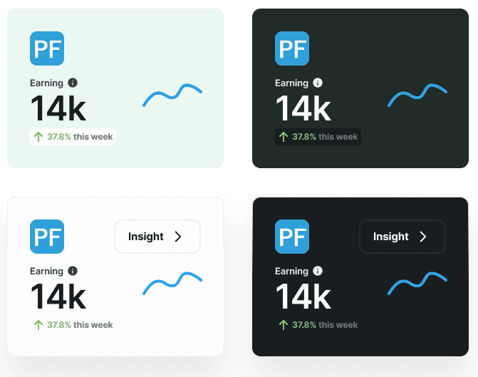
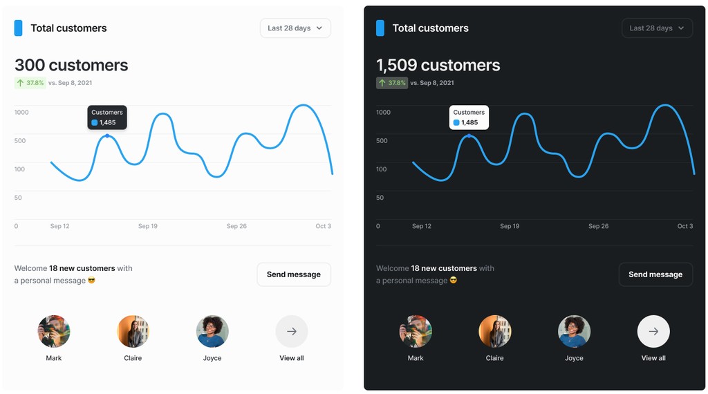
We took special note of creating a solid dark theme as the application is photography based and imagery can change gallery to gallery and photographer to photographer. This was also a big change in that we were incorporating more e-commerce features so dashboards and panels for reporting were necessary.
encouraging adoption
There’s no use having a design system if nobody’s using it, so it’s important to get the word out and encourage the product team to use it. The first, and easiest step, is always to get the design team on your side. I conducted a few workshops to get the designers up to speed on how to use and contribute to the design system. I also synced the design system figma file with zeplin , so that it could be shared with the greater product team and to allow developers to inspect the components.
Lets Talk!
